Over the past year, I've done a few projects related to public transit in the Greater Toronto Area. I worked with TTC GTFS data to map regions in the city which were far from any transit stop, and I've mapped the planned Alto HSR region overlayed with transit and population density.
Working with Canadian transit and population data is easy thanks to the high standard of data organisation and ease of access provided by Canadian ministries. Retrieving geodata from Statistics Canada, Ontario GeoHub, and the City of Toronto's Open Data Portal is simple and straightforward.
In order to challenge myself and also to learn more about my parents' city of birth, I decided to dive into the Algiers public transit system.
I wanted to begin by mapping Algiers' transit system in QGIS.
I started off by finding a shapefile of Algeria's wilayat, or provinces. Doing so was relatively straightforward.
In case I needed it, I also found a shapefile containing daïrat, or districts, which are subdivisions of provinces in Algeria.
I also found and added a layer containing an outline of Houari Boumediene International Airport.
I relied heavily on OpenStreetMap data for the rest of the data I used in my project. I used OSM data to import subway, commuter rail, tramway, and aerial tramway layers into my QGIS project, as well as their respective stations and data. While the data is very unorganized, I decided to focus only on the location of the point (for visualization) and the name:fr field, which contains the name of each station in French.
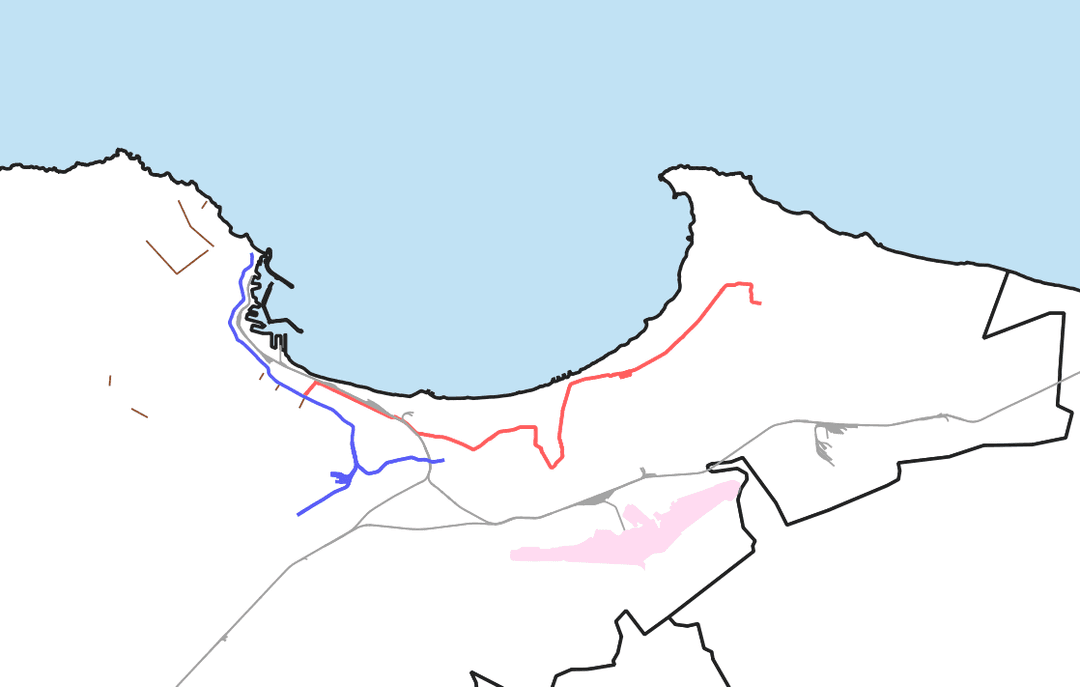
After making a basic map of the Algiers region and its trams, trains, metro, and aerial tramways, I realised that there was no official transit diagram combining these modes of transport into one graphic. Each mode of transport is operated by a different operator, so interchanges are an issue as well.
Because of this, I decided to try my hand at designing a transit diagram for the wilaya of Algiers using Adobe Illustrator.
Finding a way to organize and place the lines and stations on my graphic was a challenge due to the shape of Algiers and the non-gridlike nature of its roads.
I decided to draw the metro and tramway systems as mostly going right-left instead of drawing them as continuously curving. In this sense, my diagram is slightly misleading, but the point of a transit diagram is not to be geographically accurate, but rather to show how each station is accessible relative to other stations and routes.
With this in mind, I began working on my diagram using Adobe Illustrator. After some design work, this is what I ended up with:
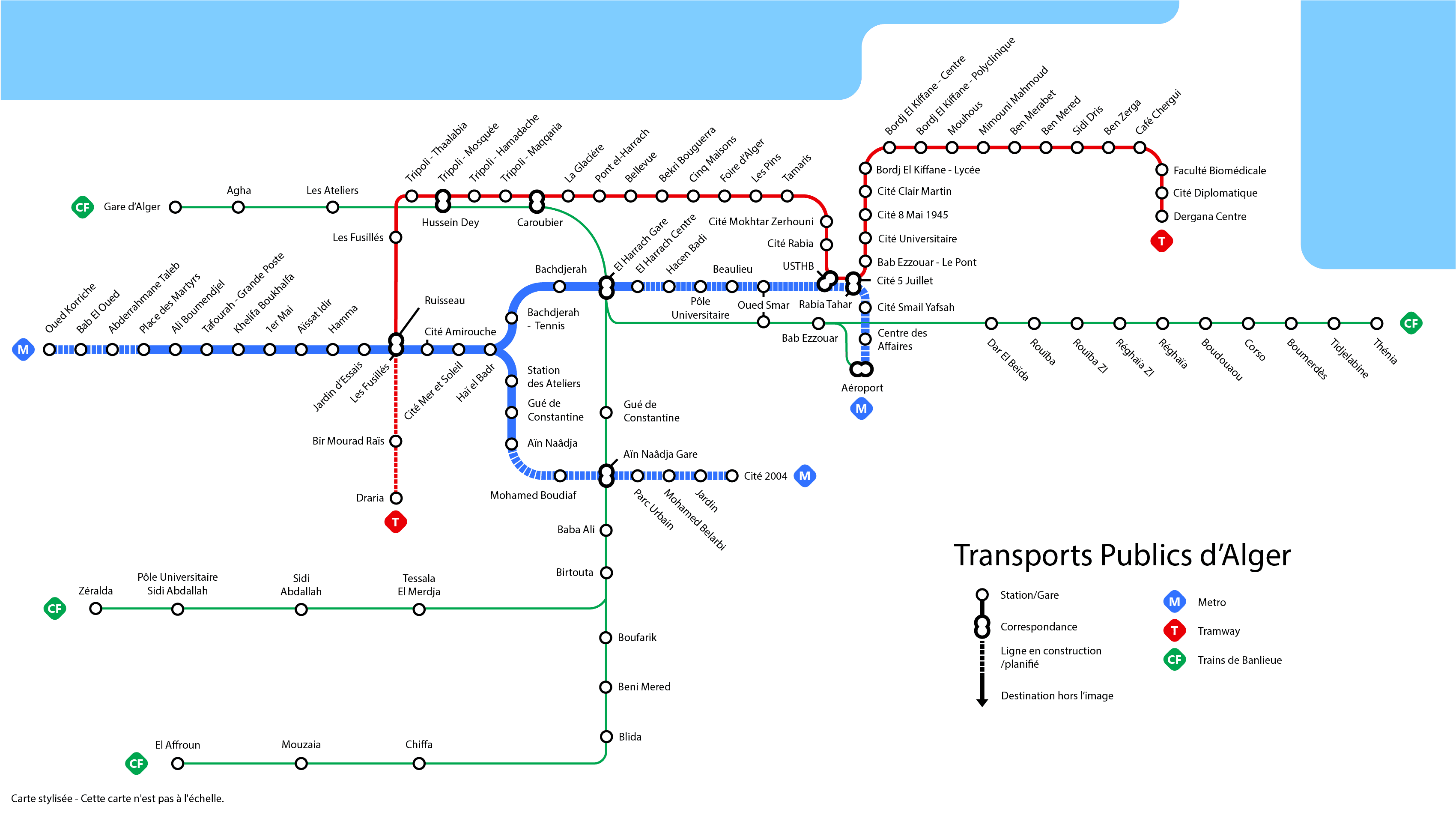
As you can see, the diagram is geographically inaccurate. The final stretch of the commuter rail and subway (Gare d'Alger, Place des Martyrs) is technically north-south, but is displayed in my map as left-right. I decided to design it this way as it was easier to read on a graphic and didn't waste too much space.
Overall, I was proud of the diagram I designed, especially considering the confusing maps which exist online and the lack of official diagrams and maps from the authorities operating the Algiers transit systems. My next step was to make this map interactive (like I did with my TTC diagram) while learning from the mistakes and limitations of my previous interactive transit map.
By exporting my diagram as an SVG file from Adobe Illustrator, I was able to manipulate the image as if it was an HTML file. I wrote a simple JSX script to rename all the station elements in the following format:
• metro_n
• tramway_n
• or train_n
so that my JavaScript program can identify which elements should be interacted with. I then wrote a large stations.js file with info regarding each station, and stylised the info panel with CSS.
You can check out the interactive web map repo on Github using this link:
I deployed the app on Vercel using the GitHub repo. You can check that out here: